Story Over Catalog: Why Nutterie Chose Glued
Learn and steal the strategy that we used to help boost key metrics so you can implement it and see similar metric lifts.
+141%
+80%
+74%
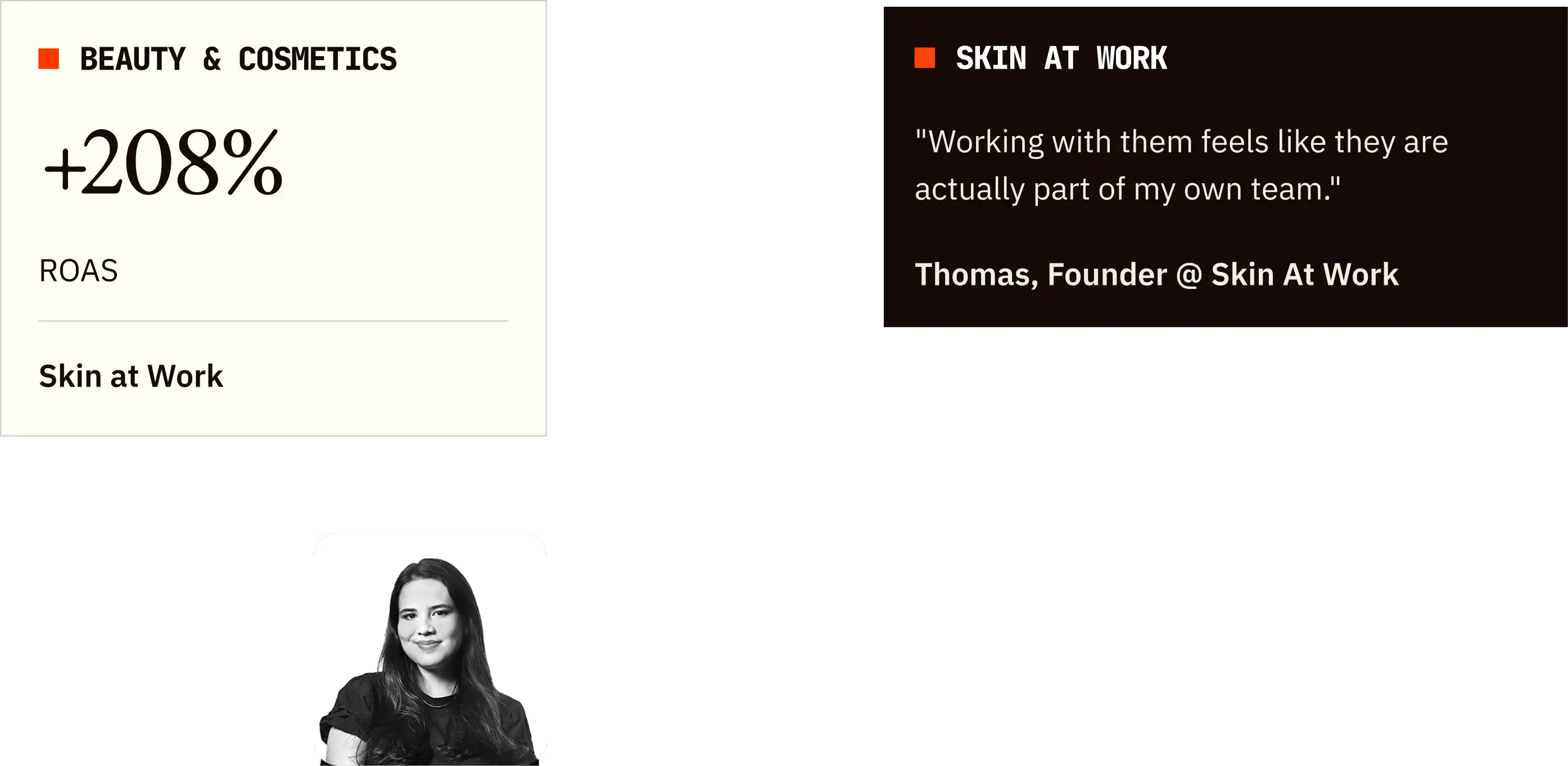
In this case study, we'll unpack how Nutterie achieved a 141% conversion rate increase, 80% sales boost, and 74% add-to-carts by creating clear product narratives instead of relying on generic product displays. More importantly, you'll discover how to escape the "everything looks the same" trap that kills conversions for brands with diverse catalogs: showing all your products equally instead of guiding customers through the story of why they need them. These strategies will show you how to transform overwhelming product variety into compelling customer journeys that make purchasing decisions feel obvious.
At glance
For context, we're a team of top strategists, designers, writers, and developers who've helped 350+ DTC brands boost conversions through web, email, and landing page optimization.
If you want a sneak peak of what your site or email could look like optimized, you may grab a free audit where we'll analyze your site/email, show you redesign samples, and give you an actionable roadmap. Or book a strategy call with our founders for a live site review, all 100% free.
Otherwise, enjoy the read and steal what works for your brand.
Nutterie specializes in premium nuts, dried fruits, and healthy snacking options that cater to various dietary needs and lifestyle choices, but here's what matters for your strategy: they represent the classic challenge facing every brand with extensive product variety that serves multiple customer needs. Like most companies with diverse catalogs, they struggled to help customers quickly understand which products were right for their specific situations, leading to browsing without buying. Sound familiar? Every marketing leader with broad product lines faces this navigation dilemma: you have amazing products for different customer needs, but your website makes everything look equally important, leaving customers overwhelmed rather than informed. Our Free Website Audit & Redesign process consistently reveals this exact pattern—brands with great products but websites that don't tell customers which ones they actually need.
Get A Free Website Audit.
We’ll identify what’s leaking revenue on your site and show you how to fix it. The free audit includes:
The "Great Products, Confusing Story" Problem
You know that frustrating realization when you have incredible products but your website makes them all blend together, leaving customers to figure out which ones solve their specific problems? That's exactly where Nutterie found themselves—excellent quality products across multiple categories, but no clear way to help customers understand the wide range of benefits and applications each product offered.
Here's what every growth professional with diverse product catalogs learns eventually: variety is an asset until it becomes overwhelming, and most websites accidentally transform product diversity into decision paralysis. Nutterie's challenge wasn't unique to food brands—it's the same problem facing skincare companies with products for different skin types, supplement brands with various health goals, or any business where the "right" product depends on customer needs that aren't immediately obvious. At Glued, we've seen this pattern repeatedly: brands that understand their products perfectly but struggle to communicate that understanding in ways that guide purchasing decisions rather than complicate them. The solution isn't simplifying your product range—it's creating clarity about how different products fit into customers' lives and goals.
From Features to Stories That Sell
This is where most brands with extensive catalogs make a critical mistake. They present products as a list of features and ingredients instead of recognizing that customers are really shopping for outcomes and experiences. At Glued, we approach diverse product ranges differently: we create narratives that help customers see themselves using the products successfully rather than trying to communicate everything about every product equally.

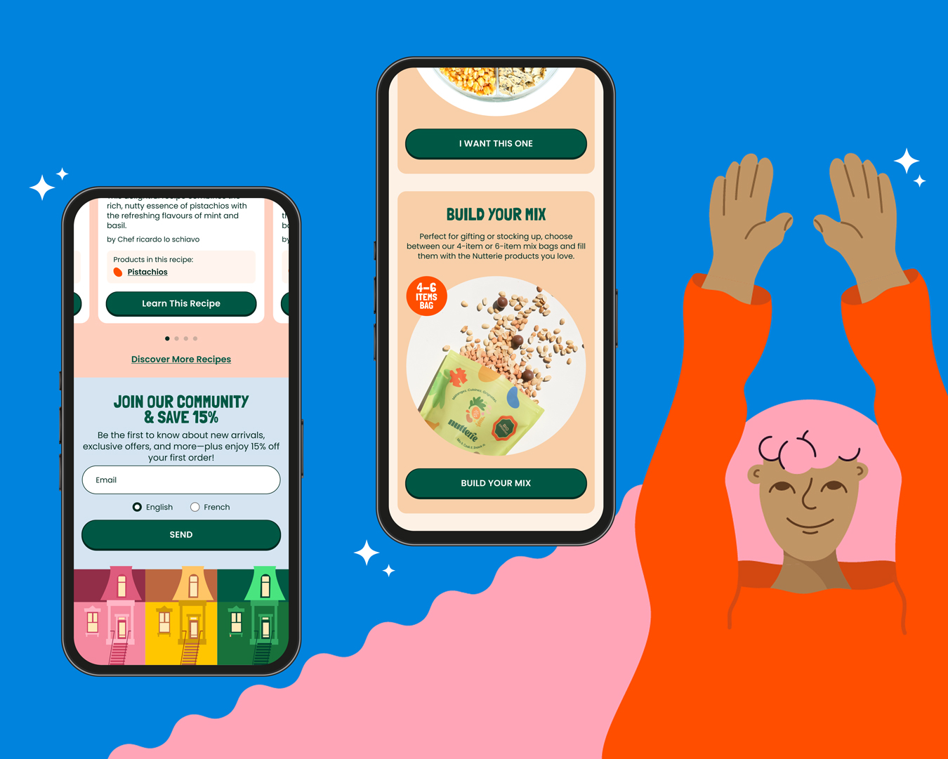
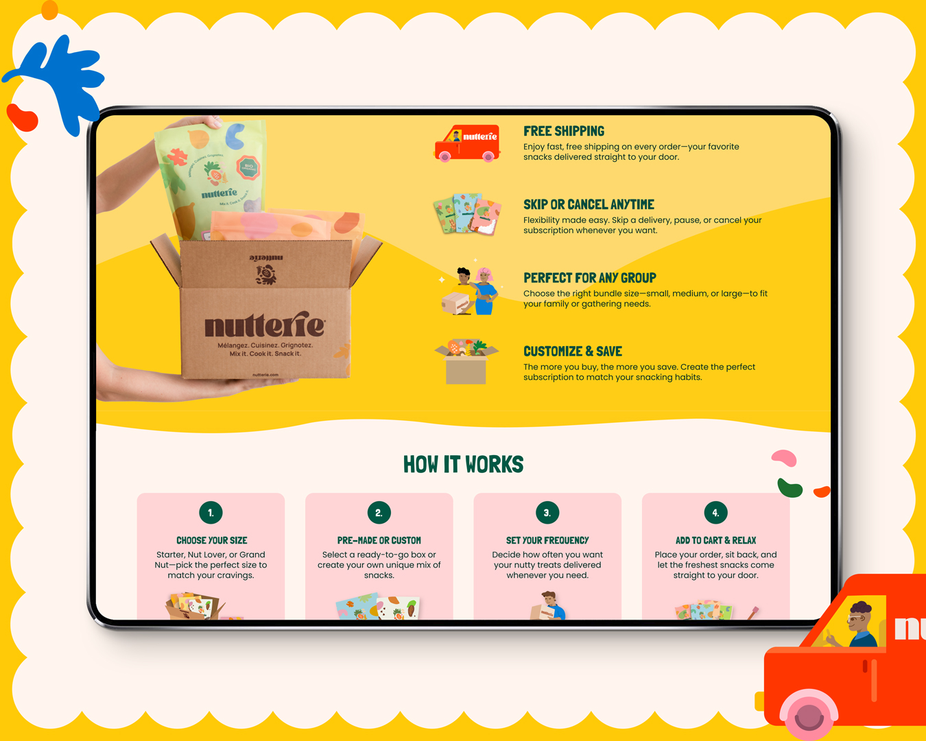
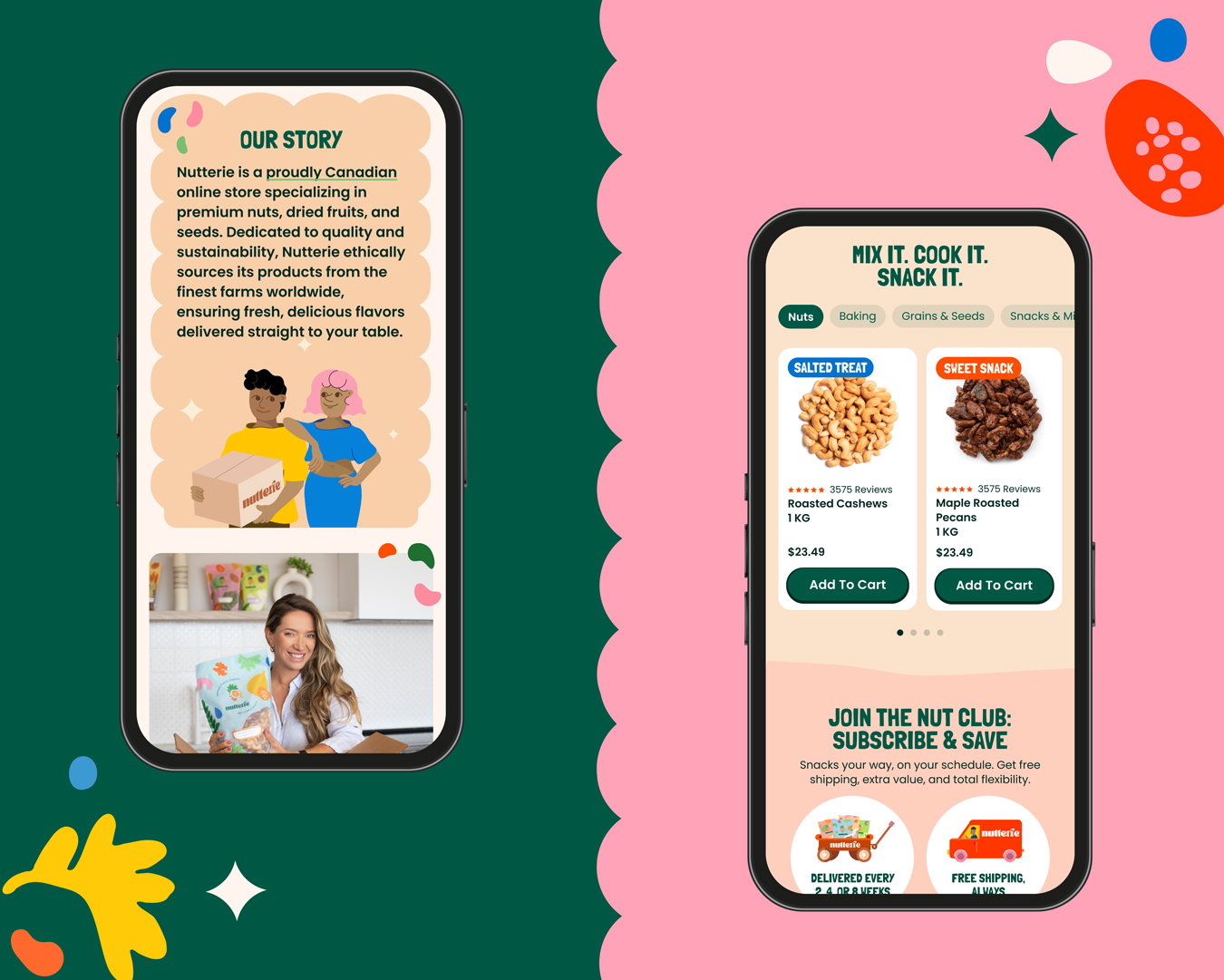
Every marketing executive with broad product lines faces this storytelling challenge: how do you showcase variety without creating confusion, and how do you highlight what's unique without losing focus? For Nutterie, our approach prioritized clarity and hierarchy by highlighting the most important product benefits first, restructuring sections to guide users naturally through the site, and creating a branded experience that conveyed value while encouraging purchases through a smooth, guided journey. We redesigned the homepage, collections, PDPs, navigation, and recipe pages to work together as a cohesive story rather than separate catalog pages. At Glued, we believe that successful product communication isn't about showing customers all their options—it's about showing them the right options for their specific needs and making those options feel compelling and achievable. The key was treating each product as part of a lifestyle story rather than an isolated purchasing decision.
When Clarity Drives Dramatic Growth
Here's the truth that will transform your next product page strategy: customers don't want more information about your products—they want clearer information about which products solve their specific problems. Nutterie's 122% conversion rate increase, 212% sales growth, and 149% order improvement came from making purchasing decisions feel obvious rather than overwhelming.
You know that pressure you feel when you have great products but can't seem to communicate their value effectively online? This approach eliminates that frustration entirely. By creating compelling narratives that clearly communicated the brand's unique value proposition while guiding customers to the right products for their needs, every visitor became more likely to convert because they could actually understand what they were buying and why it mattered. The dramatic improvements across conversion rates, sales, and order volume proved that product communication isn't just about information—it's about inspiration and confidence. At Glued, we've learned that when customers can quickly understand which products fit their lifestyle and goals, they don't just convert more often—they convert with higher order values because they feel confident about their choices.
Key Takeaways: Turning Variety Into Velocity
If you're struggling to convert customers who browse extensively but rarely buy from your diverse product catalog, these insights will change how you approach product communication and site structure. The opportunity is massive because most brands with varied offerings are still organizing around products instead of customer needs.
1. Prioritize benefits hierarchy over feature equality: We highlighted the most important product benefits first rather than trying to communicate everything about every product equally. This sounds simple, but here's what made the difference: customers could quickly identify which products matched their needs instead of reading through lengthy descriptions to figure out relevance. At Glued, we've learned that benefit hierarchy isn't just about better organization—it's about faster decision-making that leads to higher conversion rates. If you want to book a call with us, we can show you exactly how this benefit prioritization works for your specific product range.
2. Guide users through stories, not just navigation: The 149% increase in orders came from restructuring sections to create natural user flows rather than just categorizing products logically. Customers need to understand not just what you sell, but how it fits into their lifestyle, when they would use it, and why it's better than alternatives they're considering.
3. Create branded experiences that feel cohesive across pages: Homepage, collections, PDPs, navigation, and recipe pages should work together to tell one compelling brand story rather than functioning as separate catalog sections. At Glued, we've learned that cohesive experiences build trust and confidence that carries through to purchase decisions, while disjointed experiences create doubt that kills conversions.
4. Communicate variety as solutions, not just options: Instead of presenting a wide product range as "lots of choices," we positioned variety as "solutions for different needs." This reframing helped customers see product diversity as helpful customization rather than overwhelming decision-making, leading to higher engagement and conversion rates across all product categories.
5. Let product narratives drive site architecture: Here's the insight that every marketing leader should take to their next site redesign discussion: your website structure should follow customer decision-making patterns, not internal product organization logic. At Glued, we proved with Nutterie that when you organize around customer stories rather than product categories, conversion rates improve dramatically because customers can actually find what they need. Start with our Free Website Audit & Redesign to see exactly how your current product presentation performs compared to story-driven benchmarks, and discover why narrative clarity always beats catalog completeness for driving actual sales.
These metrics reflect performance at the time our implementations were measured and analyzed. Results may vary over time as products evolve, market conditions change, or additional modifications are made.


We're a Global Team of Strategists, Designers, Copywriters, and Developers