Predictable ROI: Why DR-HO's Picked Glued
Learn and steal the strategy that we used to help boost key metrics so you can implement it and see similar metric lifts.
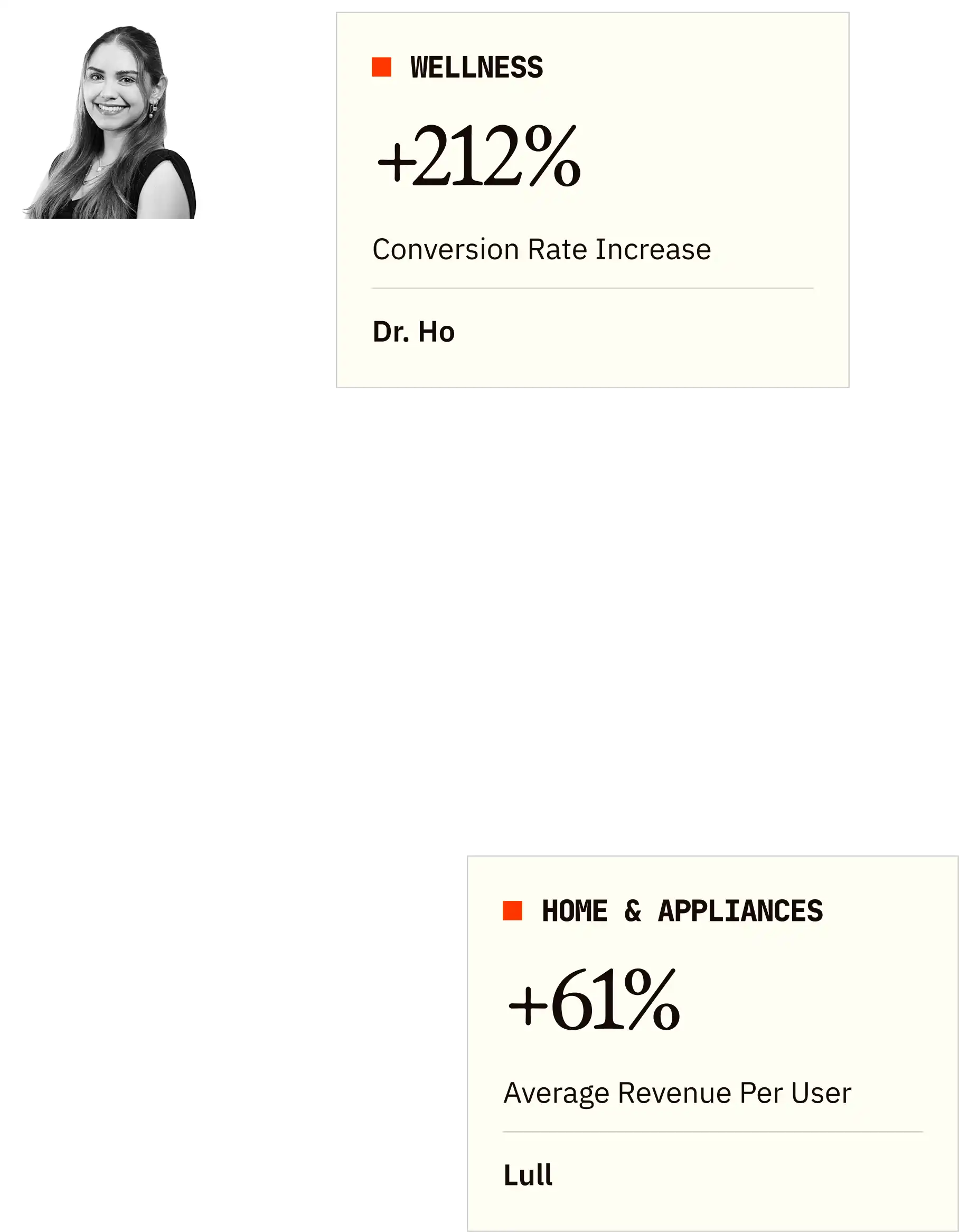
+122%
+212%
+149%
In this case study, we'll unpack how DR-HO'S achieved a 122% conversion rate increase and 212% sales boost by designing specifically for their older adult audience. More importantly, you'll discover how to escape the trap that catches every marketing leader: building websites that impress your team but confuse your customers. These actionable strategies will show you how to bridge the gap between who you think is buying and who's actually converting—regardless of your industry.
At glance
For context, we're a team of top strategists, designers, writers, and developers who've helped 350+ DTC brands boost conversions through web, email, and landing page optimization.
If you want a sneak peak of what your site or email could look like optimized, you may grab a free audit where we'll analyze your site/email, show you redesign samples, and give you an actionable roadmap. Or book a strategy call with our founders for a live site review, all 100% free.
Otherwise, enjoy the read and steal what works for your brand.
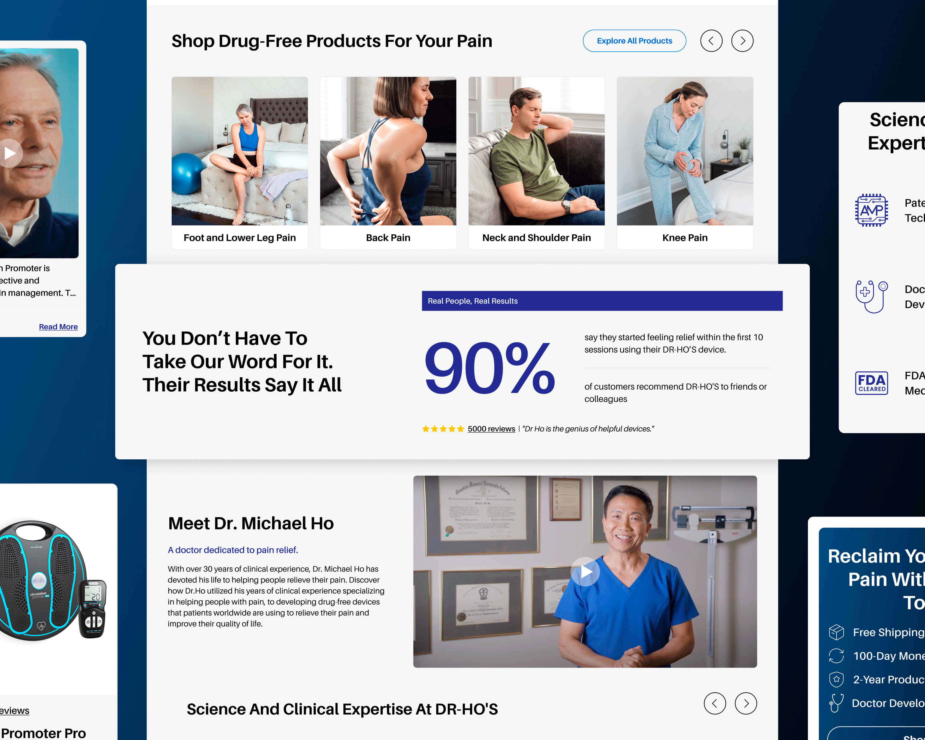
DR-HO'S is a leading manufacturer of pain relief devices founded by Dr. Michael Ho, but here's what matters for your strategy: they're a perfect example of a brand whose actual customers don't match typical ecommerce assumptions. While most companies chase younger demographics, DR-HO'S built a loyal following among adults over 50 seeking drug-free pain management solutions. Sound familiar? Every growth professional faces this same challenge—your real buyers often look nothing like the personas in your marketing deck, and your conversion rates suffer because your site was built for the wrong audience entirely.
Get A Free Website Audit.
We’ll identify what’s leaking revenue on your site and show you how to fix it. The free audit includes:
The "Young Designer, Old Customer" Gap
You know that sinking feeling when you realize your entire conversion strategy is built on assumptions that don't match reality? That's exactly where DR-HO'S found themselves—and if you're honest, it's probably where you are too. Most ecommerce sites are designed by 20-somethings for 20-somethings, but their customers are primarily adults over 50 dealing with chronic pain conditions. Their old site looked modern but completely missed the mark on usability for their actual buyers.
Here's what every decision-maker discovers the hard way: your internal team can't see the blind spots because they're not your customer. Tiny buttons, confusing navigation, and cluttered product pages created frustration exactly when customers needed clarity and confidence. The disconnect was obvious once we started our Free Website Audit & Redesign process. At Glued, we've learned that conversion optimization isn't just about prettier buttons—it's about understanding exactly who clicks those buttons and why they hesitate. The challenge wasn't making the site look better; it was making it work better for people who experience the web differently than your design team assumes.

Designing for Reality, Not Demographics
This is where most agencies fail spectacularly. They'll talk about "user personas" and "demographic research," but they're still designing for themselves. At Glued, we take a different approach—we design for behavior, not assumptions. The breakthrough came when we stopped thinking about "seniors" as a demographic and started thinking about pain relief seekers as real people with specific needs.
Every marketing leader faces this same dilemma: how do you balance what looks impressive in board meetings with what actually converts customers? Larger clickable areas, higher contrast ratios, and simplified navigation weren't just accessibility features—they were conversion features. We redesigned every product detail page to tell a clear story: what this device does, how it helps, and why it works, without requiring customers to hunt for basic information. Our Full Website Overhaul approach meant rebuilding everything from the homepage to the checkout flow with intentional positioning for this audience. At Glued, we believe that when you solve for your most challenging user, you accidentally create a better experience for everyone.
When Design Meets Real Results
Here's the truth every growth executive learns eventually: pretty websites don't pay the bills, converting websites do. The numbers speak to the power of inclusive design: 122% higher conversion rates, 212% increase in net sales, and 149% more orders within the first month. But here's what really matters for your next board presentation—customer service calls about "website problems" dropped by 60%, and the average time spent on product pages increased dramatically.
You know that pressure you feel to show immediate ROI on every marketing investment? This is exactly the kind of result that makes those conversations easier. What's particularly impressive is how these improvements helped across all age groups, not just older customers. At Glued, we've seen this pattern repeatedly: when accessibility becomes the foundation, every subsequent improvement compounds more effectively. The site now supports our Ongoing Optimizations strategy perfectly because every element was built with testing and iteration in mind. No more choosing between what looks good and what works—you get both.

Key Takeaways: Converting the Customers Others Ignore
If you're tired of marketing strategies that work in theory but fail in practice, these insights will change how you think about conversion optimization. The opportunity is massive because most competitors are still designing for their own age group instead of their buyers.
1. Test your site with people who actually have arthritis: Your 25-year-old designer can't simulate the experience of someone with joint pain trying to navigate tiny buttons on a phone. This sounds obvious, but here's what shocked us: we literally tested every interaction with customers in DR-HO'S target demographic and discovered dozens of friction points that looked fine in design but failed in reality. If you want to book a call with us, we can show you exactly how this testing process works for your audience.
2. Information hierarchy becomes critical when cognitive load is higher: You've probably noticed that younger users scan and piece together information from multiple sections, but older adults often prefer linear, complete information in logical order. At Glued, we restructured every product page to answer questions in the sequence customers actually ask them, not the order that looked aesthetically pleasing. This is the difference between designing for Instagram and designing for revenue.
3. Trust signals need to be obvious, not subtle: When someone is investing in pain relief, skepticism is natural and healthy. We made social proof impossible to miss without making it feel desperate or pushy. At Glued, we've learned that trust isn't built through clever copy—it's built through transparent, consistent communication at every touchpoint.
4. Mobile optimization can't just be "smaller desktop": This is where most agencies completely miss the mark. Older adults often have different phone holding patterns, finger dexterity, and screen preferences than younger users. We redesigned mobile interactions specifically for larger finger targets, simplified gestures, and clearer visual feedback. The mobile experience isn't secondary—it's often the primary buying decision moment.
5. Inclusive design is profitable design: Here's the insight that every marketing executive should take to their next strategy meeting: the principles that make sites work better for older adults—clarity, simplicity, obvious navigation—improve conversion rates across all demographics. At Glued, we call this "designing up," and it's why inclusive design isn't just ethically right—it's financially smart. Start with our Free Website Audit & Redesign to see exactly how your current site performs for different user groups, and discover the massive market opportunity that most of your competitors are ignoring completely.
These metrics reflect performance at the time our implementations were measured and analyzed. Results may vary over time as products evolve, market conditions change, or additional modifications are made.

We're a Global Team of Strategists, Designers, Copywriters, and Developers